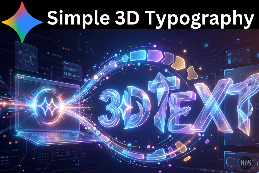
Sometimes 3D text looks cool but the process feels way too complicated, full of extra effects and messy layouts that you don’t really need. You just want something clean that works for thumbnails, banners, or posts without spending hours in Photoshop or learning 3D software. With Gemini AI, you can actually get there pretty fast if you know how to talk to it the right way and keep things simple. 😊
In this post I’m walking through how I personally build minimal 3D text using Gemini AI, focused on smooth edges, simple lighting, and a neutral background that doesn’t fight with the words. I’ll show you how I set up the prompt, tweak the style, and make sure the text stays readable even when the design looks a bit glossy or cinematic. The idea is to give you a repeatable process you can copy for different words, colors, and uses.
I’m also keeping everything beginner friendly so you can follow along even if this is your first time playing with Gemini image generation. No extra tools, no complicated pipelines, just using Gemini to create the image and making smart choices with prompts and variations. By the end, you’ll have a clean 3D text style you can reuse for titles, logos, or social posts, and you’ll actually understand what’s happening instead of just pasting random prompts. 🚀
How Gemini AI Handles 3D Text And Why Clean Design Matters
When I work with 3D text in Gemini AI, I think of it like directing a designer instead of coding a 3D scene, because the model responds best when I describe the look in normal language that still has clear details. It can simulate depth, shadows, reflections, and lighting if I ask for them, but if I throw too many adjectives in the prompt, I often end up with noisy results or text that’s hard to read. So I keep my instructions tight and focused around clarity, depth, and background.
Clean 3D text matters because you usually use it in places where people only look at it for a second like a thumbnail or a cover image, and messy effects just slow them down. If the word pops, the lighting feels intentional, and the background is simple, people understand the message instantly. I’ve found that simple color palettes and basic shapes like block or rounded letters always work better than super complex metallic or cyberpunk styles when your goal is just clean and modern.
Another thing I pay attention to is how Gemini handles the word itself because sometimes it wants to add extra letters or duplicate text when the prompt is vague. To avoid that, I clearly say I want a single word in the center, rendered as 3D, and I remind it that the text should appear only once. That tiny detail makes a big difference, especially if you plan to reuse this style across different designs and need consistency for your personal brand or project. ✨
Steps to Generate a Simple and Clean 3D Text Image Inside Gemini AI
- Open Gemini AI and switch to the image generation mode where you can create pictures from text.
- In the prompt box, type the exact word you want to turn into 3D text and mention you want only that single word in the design.
- Add a clear description like clean minimal 3D block letters in the center with smooth edges and soft shadows.
- Specify a simple background color such as solid white, light gray, or soft pastel so the text stays readable.
- Mention lighting details like soft studio lighting from the top front to keep the shadows natural and not too dramatic.
- Add a note that the text should look like a real physical object and not a flat graphic to push the 3D feel.
- Include your preferred color for the letters such as matte dark blue, glossy black, or bright orange while staying minimal.
- Tell Gemini not to add extra objects, characters, or logos so the focus stays on the text only.
- Hit generate and wait for the image, then review if the word is correct, centered, and clean, and if not, tweak the prompt slightly and regenerate.
- Once you get a version you like, save the image and reuse the same prompt structure with new words whenever you need more 3D text. 🎯
How I Write Prompts For Minimal 3D Text That Actually Looks Good
When I write prompts for 3D text in Gemini AI, I start with the word itself then build a small sentence around how I want it to look and where I want it placed in the frame. I usually say something like: create a clean minimal 3D text of the word STEPS in bold block letters centered on a plain background with soft studio lighting and subtle shadows. That covers the main layout without overcomplicating the instructions, and it signals to Gemini that I care about cleanliness and readability more than crazy effects.
I also like to include a quick line about material and finish, because that’s what makes the text feel like an object instead of a flat logo. If I want it more modern, I’ll go for matte plastic or smooth soft touch surfaces, and if I want a bit more punch, I’ll ask for glossy letters with gentle reflections but still keep the background simple. The trick is balancing detail with simplicity, so I avoid stacking too many contrasting colors and instead focus on one main color for the letters and one neutral tone behind them.
Color choices matter a lot here, and I personally avoid heavy gradients unless I’m going for a specific vibe, because gradients can easily make the design feel busy. I’ve had good results with monochrome setups where the letters and background are different shades of the same color family, like dark navy letters on light blue, or charcoal letters on soft gray. Once I find a combo that fits my style, I save the prompt somewhere and just swap the word and color for new projects, which makes my workflow feel smooth and predictable. 😌
Easy Ways to Refine and Keep Your Gemini 3D Text Looking Clean and Consistent
After I generate the first version of the 3D text image, I almost never stop there, because the first output is usually close but not perfect. I look for little things like shadows that are too heavy, highlights that blow out parts of the letters, or backgrounds that feel slightly textured when I asked for flat. Then I ask Gemini to soften shadows, reduce reflections, or simplify the background by describing exactly what I want fixed. This back and forth feels more like art direction than editing and that’s the fun part for me.
I also double check alignment and spacing by visually scanning how the word sits in the frame, because if the text is off center or too close to the edge, it can feel awkward in a thumbnail or layout. If it looks off, I mention in the next prompt that the word should be perfectly centered with enough margin around it, almost like a poster. Over time, this fine tuning process gives me a signature look where my 3D text feels clean and consistent, and people start recognizing it across different graphics.
For different use cases, I tweak just a couple elements instead of redoing everything, like using brighter colors and stronger contrast for social posts, and softer tones for presentation covers or portfolio pieces. The part I enjoy most is that once you understand how Gemini responds to prompt adjustments, creating new 3D text styles feels fast and flexible, and you don’t have to rely on heavy manual editing every single time. 🌈
Conclusion
When I think about simple and clean 3D text, I see it as a mix of clear wording, smart prompts, and a bit of patience with the Gemini AI outputs. You don’t need advanced 3D skills to get something that looks polished, you just need to describe what you want in a focused way and tweak until it matches your taste. Once you lock in a style that feels like you, it becomes really easy to reuse it across your content.
If you follow the steps and ideas here, you’ll end up with 3D text that looks modern without being noisy, and that actually helps your message stand out instead of distracting from it. The more you play with color, lighting, and materials inside Gemini, the more you’ll understand what works best for your vibe, and that’s where the real fun starts. 😍
FAQs
How many words should I use for clean 3D text in Gemini AI?
I usually stick to one short word or a very short phrase because Gemini handles spacing and letter shapes more cleanly when there’s less going on in the scene.
Can I use complex fonts for my 3D text?
You can ask for stylish or modern fonts, but I keep it simple with bold block or rounded letters so the 3D effect looks clean and the text stays readable at small sizes.
What background works best for minimal 3D text?
Plain backgrounds like solid white, light gray, or soft pastel tones work best, because they keep the focus on the word and make shadows and lighting feel more controlled.
How do I stop Gemini from adding extra elements around my text?
I clearly say that I only want the word in the center with no extra objects, characters, or decorations, and if it adds something anyway, I correct it in the next prompt.
Can I reuse the same prompt for different words?
Yes and that’s what I do most of the time, I keep the structure of the prompt the same, then only change the word and maybe the color so the style stays consistent across all my designs.